derJuraj
Visual identity for not only a language teacher, but also a creator of high-quality learning materials, and a german pub quiz organizer.
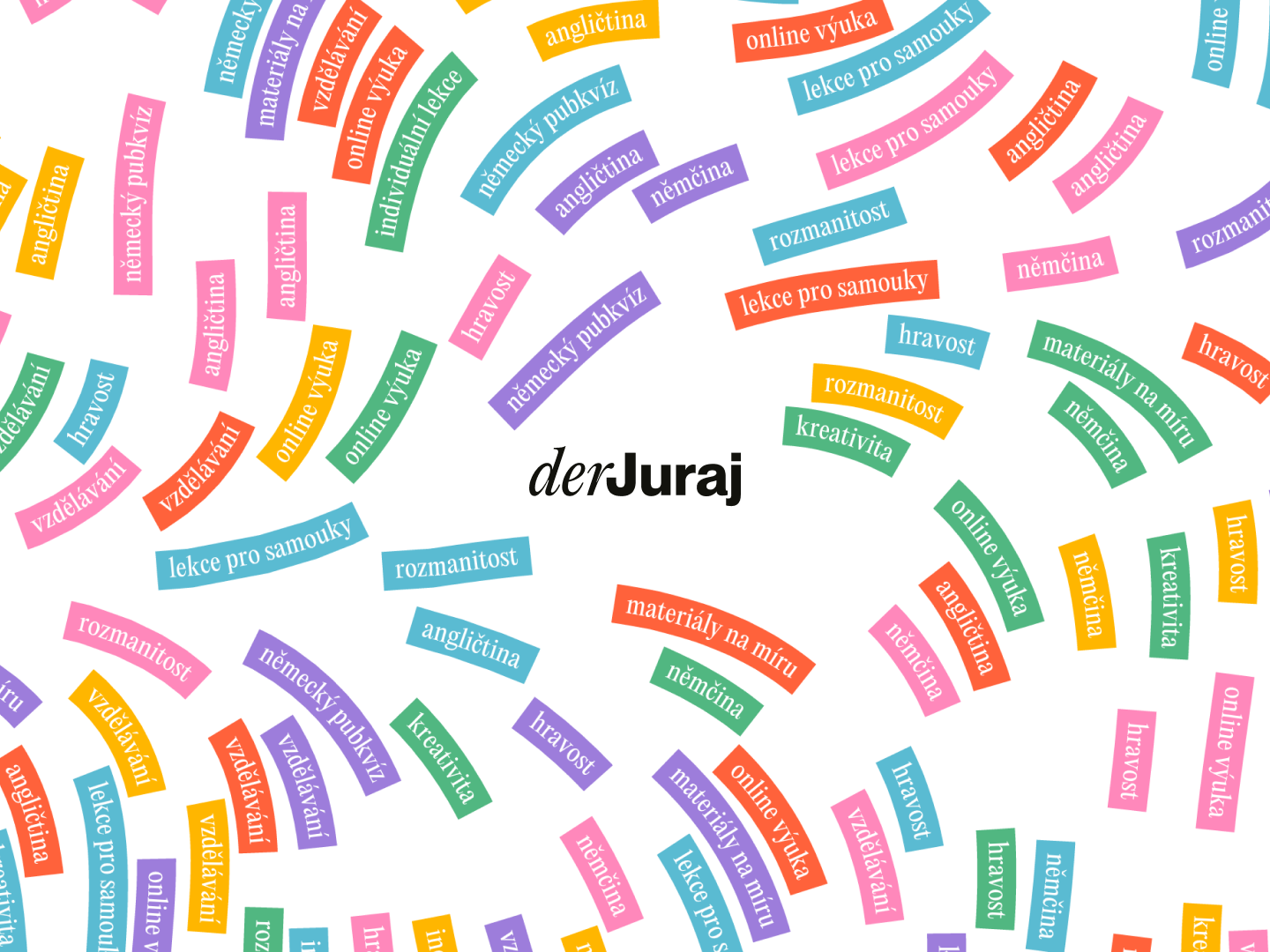
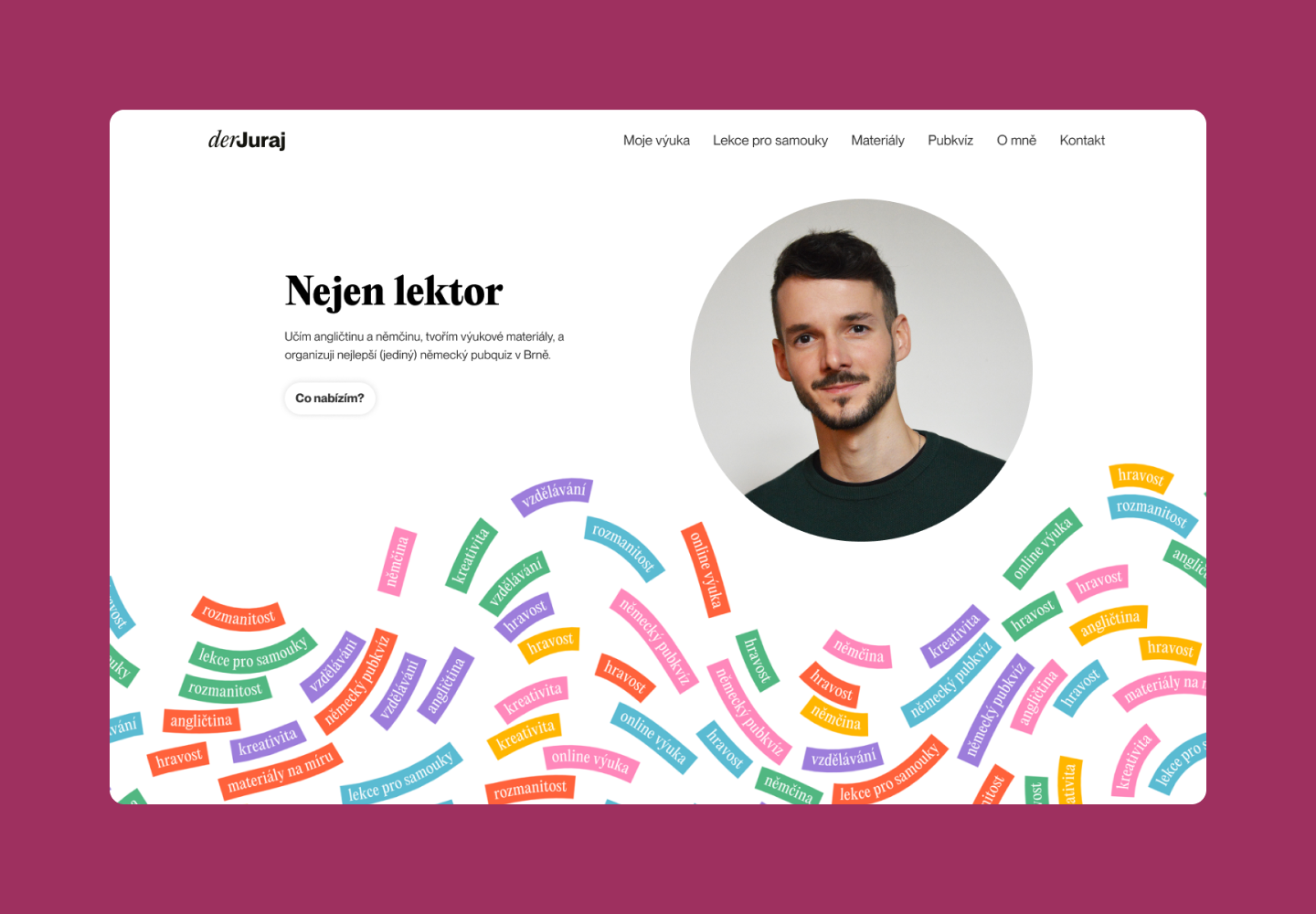
The base of the visual identity is the flow of words. The flow is not done by hand, instead, quite an extensive generator was developed. The generator allows the designer to specify words, the flow shape, the palette, and much more.
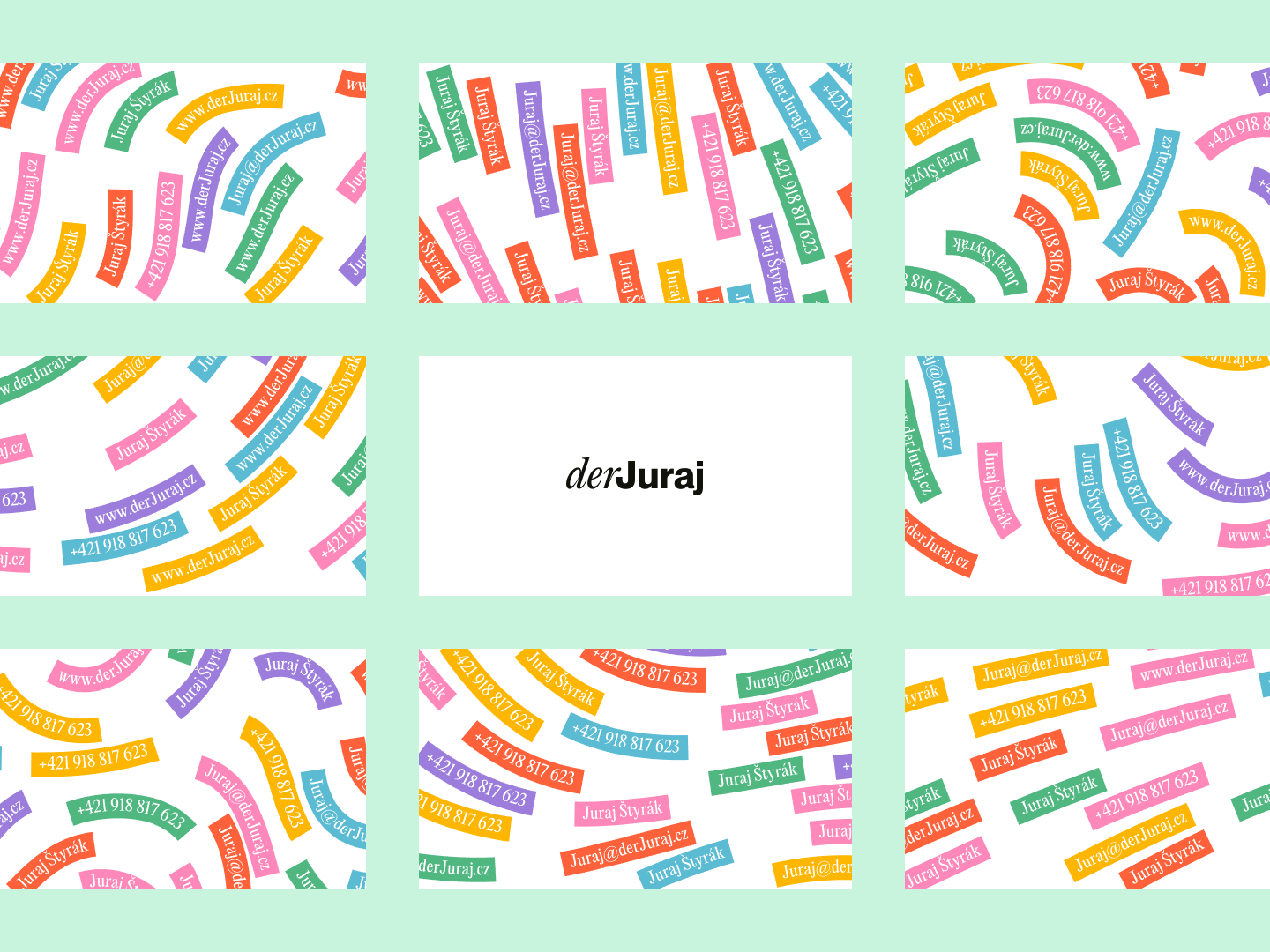
The flow is used throughout the whole identity. On business cards…
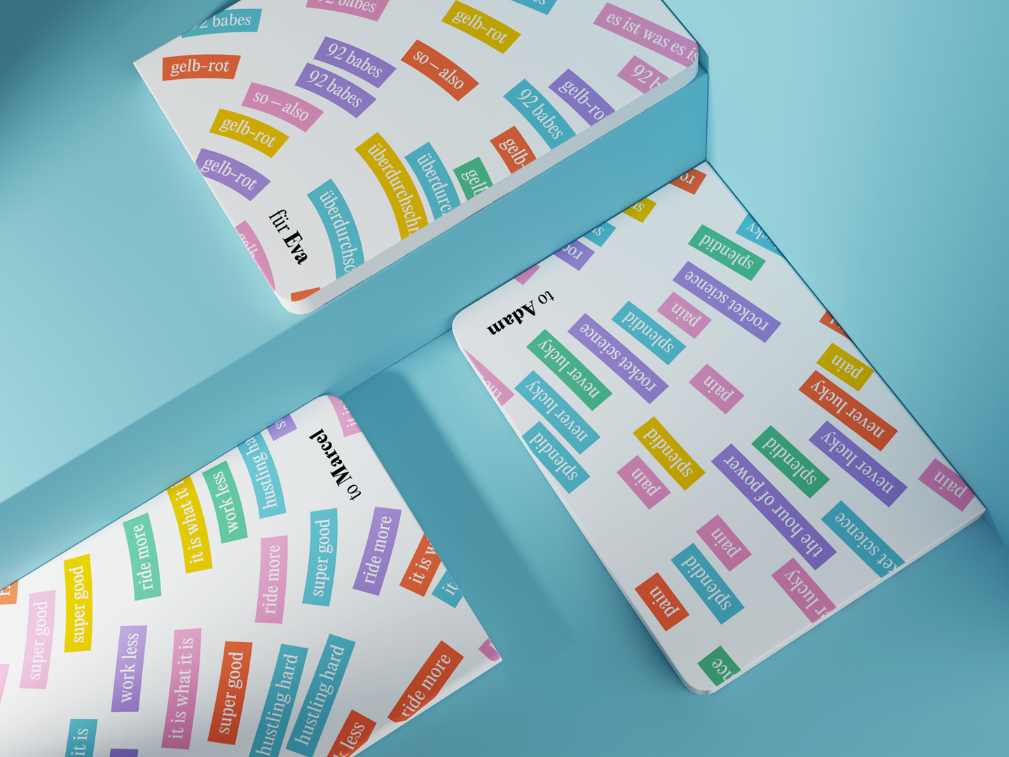
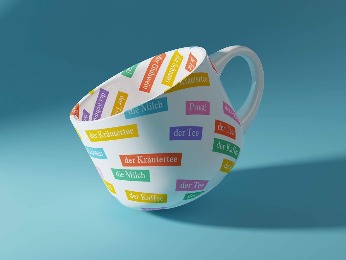
…or in customised merchandise for clients. Each student can be gifted a notepad with their very own favorite words and phrases on the cover.
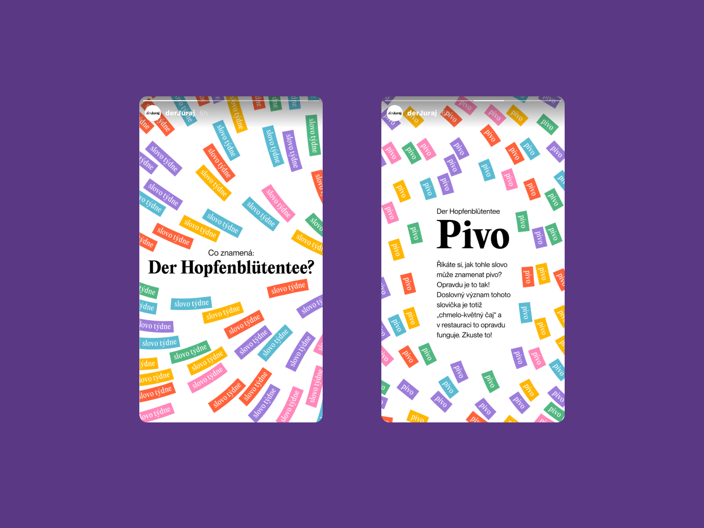
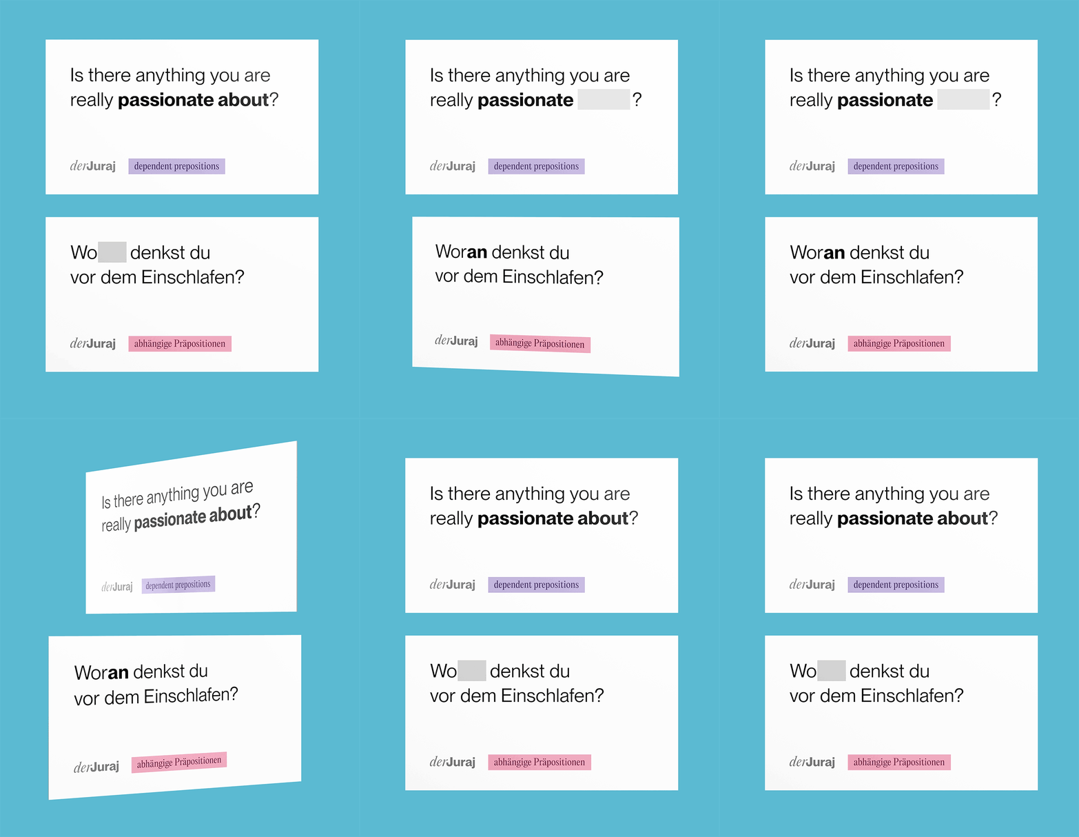
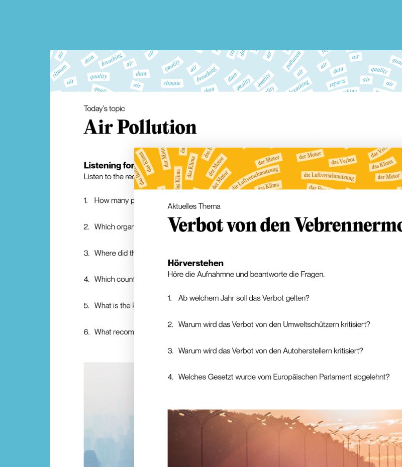
The flow can be added to study materials as category tags or as phrases or words that are used throughout the lesson – mimicking the notes students sometimes make when memorizing words.
“Playful but not gimmicky, impressive yet never overwhelming, yielding but with clearcut character – Adam expertly managed to capture the essence of my work. The foundations remain constant, but the outcome of what I do is never the same. I wanted my visual identity to reflect that. The flow feature in combination with a well balanced colour palette and classy fonts give me endless possibilities for creating fun linguistic experiences for my clients.” — Juraj Štyrák
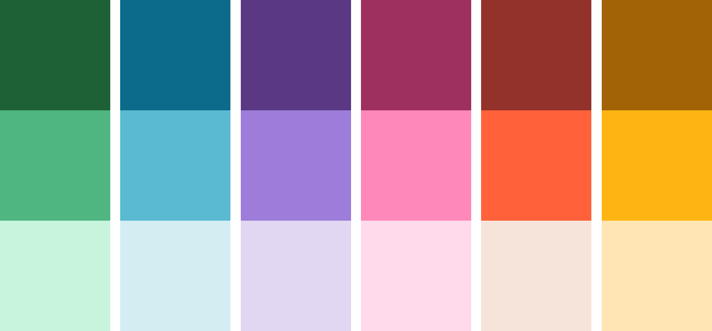
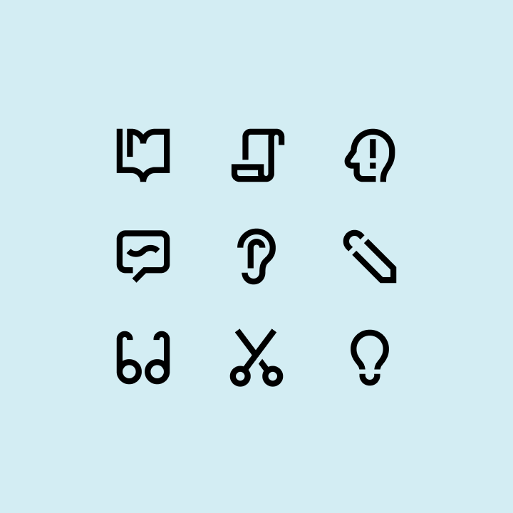
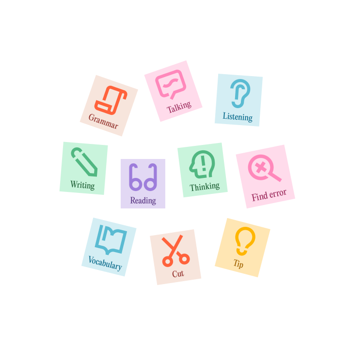
The set of icons for the learning materials is very simple – almost as if made from the flow elements themselves.
The generator can even create GIFs!